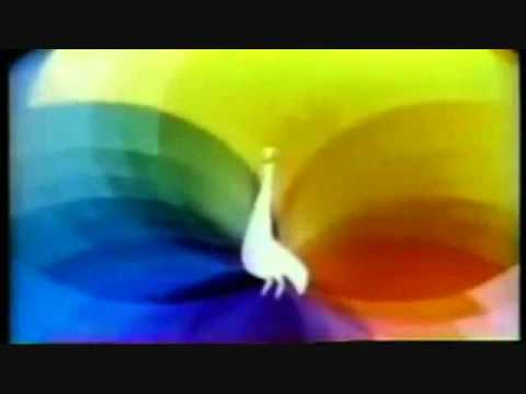
NBC Television Logos…1926 – 2000
On September 7, 2014
- TV History
NBC Television Logos…1926 – 2000
As part of today’s 57th Anniversary of the NBC Peacock logo, I thought I’d add this montage. Someone did a good job with this, which is actually pretty accurate and inclusive…especially the first three minutes or so. I always thought the Snake logo was the best. What’s your favorite? Enjoy and share! – Bobby Ellerbee
https://www.youtube.com/watch?v=FkjlCbOjyWM
HOPE YOU LIKE IT!!! List: 1920s Radio on USA – 1926 1930s 2nd logo – 1931 Man plays chimes – 1933 1940s Microphone WNBT – 1944 Curtain with text – 1949 1950s…
A great network but far better in earlier times!
That segment that rolls through all the logos from 5:43 to 5:47 was part of a Windows screen saver NBC put out in (as I recall) the 90s. It also had the individual logos silently drifting across the screen.
This brings back a lot of memories.
The original NBC animated peacock. Waited in the dept. store TV dept. for it to come on. That is if there was a color telecast that day.
What?! They’ve pre-empted “Hotdog” & “Jambo”? This is an outrage!
The current peacock is not going anywhere I think… It does not have feet!
Golly… my life and career with NBC flashes before my very eyes…
I can remember a lot of these, lots of memories. Thank you!
And who could forget the famous logo controversy in 1976 when NBC paid one million dollars to create a stylized “N” logo. Unfortunately for NBC, it had already been created and in use by a PBS station in Nebraska. And I bet they didn’t pay one million dollars to create it either!
On the walls at NBC Burbank…
I miss the bird. I realise he was selected because at the time color (TV) was “new” and the peacock was/is one of the most “colorful” natural beings in nature, but I grew up near the “midwest flagship” and actually spent time in and around those 39 (count ’em) studios on the 18th and 19th floors and I lived thru the chimes, the “serpent” as I have been told it was referred to, and remember the summer of 66 or 67 when the network went “all color” (pushing ’41’s around, who needs a health club) and I just miss him. (side note, I think the sneezing version was for Laugh-In)
It was ways nice to see how well your color TV worked when “The Bird” popped up, almost like a color bar chart we use now!
I remember a color version of the animated chimes, one of my favorites… although the snake is hard to beat. All better than Nebraska PBS.
the late great NBC.
Hard to believe that the current peacock has been pretty much NBC’s longest lasting logo to date with 28 years. Except if you read book “Identity” on Chermayeff & Geismar, who designed the peacock, they say that the logo was designed in 1980, but purposely delayed by NBC because of how badly they were doing at the time.